I have always been interested in graphic design so knew I wanted to pursue a career in it. I enjoy being creative and coming up with different designs. I’ve always had a passion with packaging and branding so focus on this however I have tried to develop my skills over the three years at Cardiff Met. I enjoy be able to experiment with my outcomes and not afraid to try something new.
Throughout my practise I have always tried to be different and experiment with my designs even if they worked or not I would learn from these experiments. However with all my work I do try and keep my designs simple and modern.
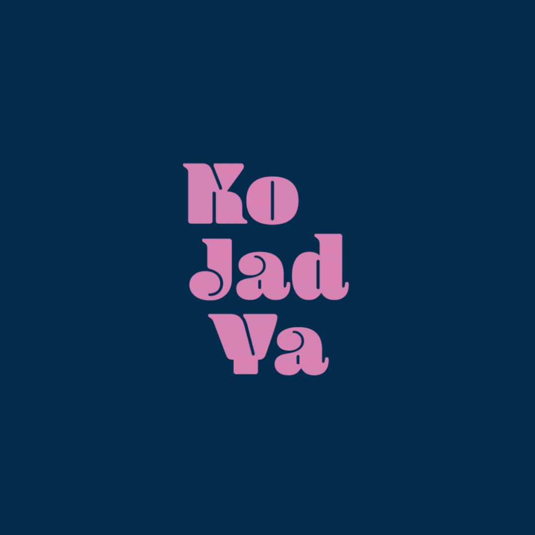
With my Final Major Project I wanted to do something to do with branding and packaging, so I decided to come up with a branding project on a Thai Restaurant. Within Thai cuisine it is important that with every dish the balance of flavours are right which in my eyes is like conducting an experiment, so with my design I wanted the Thai restaurant to focus on this aspect, creating a new way for customers to order their food and having control on what products and flavours goes into their dish. The brand is called ‘Kon Jad Ya’ which is how you pronounce ‘Chemist’ in Thai. Overall the whole look of the brand is simple and modern.
[instagram-feed user=BAGCw210 layout=carousel carouselrows=1 carouselarrows=true hovercolor=#E14715 showheader=false followcolor=#020D81 includewords=”#mattersshow” order=”top showcaption=”false”]